By Niki Mosier and Brett Woodward
You may have heard the term “web accessibility” before, but you might still have a few questions. Here’s a few of the most common ones:
What does web accessibility actually mean?
What are the benefits of having an accessible site?
How can I test my site’s accessibility and make it better?
This guide breaks down the most important aspects of web accessibility so you can provide a better online experience for every person that visits your site.
We’ll go over what web accessibility is, why it’s so important for both you and your users, and how you can improve your site.
What is web accessibility?
Web accessibility means that websites, tools, and technologies are designed and developed so that people with disabilities can use them.
There are many types of disabilities that make navigating the Web difficult, and later in the guide we’ll go over them and provide recommended strategies for each one.
For now, it’s important to recognize that some users who visit your site might have one or more of the following disabilities:
- Auditory
- Cognitive
- Neurological
- Physical
- Speech
- Visual
Some of your users may not be able to use a keyboard or a mouse. Some of them may be colorblind or fully blind.
Web accessibility is about removing barriers to create a user experience that allows people with disabilities to perceive, understand, navigate, and interact with your site, tool, or service.
Before we dive into all the benefits of digital accessibility, it’s important to understand the struggles that some users experience when trying to navigate the Web.
Read on to learn more.
What are the most common web accessibility issues?
If you’re not sure what issues web accessibility attempts to fix, check out this list of the most frequent problems that users with impairments encounter on the Web:
- Text that doesn’t wrap when scrolling is needed
- Links missing descriptive anchor text

- Font sizes that are too small to read
- Animations and carousels can be hard to navigate
- Poor contrast of elements due to similar colors and lack of space
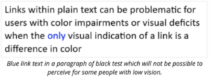
- Reliance on color to differentiate elements and navigation

- Code issues for people dependent on keyboards only.
- Example: By default, specific HTML elements (anchors, form controls, image map areas) receive keyboard focus. However, complex controls not directly available in HTML are often constructed with the use of “generic” HTML elements such as or
, coupled with additional JavaScript behavior to make them interactive. These elements do not receive keyboard focus unless they are properly coded, and are therefore impossible for keyboard-only users to reach.
Quick Accessibility Test
If you want some hands on accessibility experience, here’s a helpful exercise to get a glimpse at some of the issues that certain users face:
Try using your website using only keyboard controls, and make notes of what the experience is like.
- Tab key moves to the next link, form element, or button.
- Shift+Tab moves to the previous link, form element, or button.
- Enter or spacebar activates the current link or button.
- Try the arrow keys, Escape key, and other keys, too.
As you go around websites, notice:
- How easy or hard is it to tell where the focus is?
- How much longer does it take to move around with the keyboard only?
- Does any text disappear or get cut off?
- Does any text, images, and other content overlap?
- Are all buttons, form fields, and other controls visible and usable?
- Is horizontal and vertical scrolling required to read sentences or “blocks of text”?
Now that you know the goal of web accessibility and some of the issues that users face, in the next section we’ll go over why accessible design is so important for both your site and your users.
Some of the stats may surprise you.
Why is web accessibility so important?
To start off this section, here’s a little quiz:
Why should you design your site with accessibility in mind?
- It’s the right thing to do
- It’s the law
- It helps more people use your site
- For Google
- All of the above
If you answered “All of the above”, you’re right! There are lots of reasons why you should prioritize accessibility. It helps your users, it helps your site, and it helps Google. When the Web is more user-friendly, everyone wins.
Let’s dig a little deeper.
Did you know that over 61 million U.S. adults have a disability? This 2018 CDC study showed that 1 in 4 people in America have some sort of disability that “impacts major life activities”. That’s 25% of the population!
There are millions of people who are perfectly capable of digesting and using information on the Web that run into problems accessing that information due to the design of the site or technology.
That being said, there are many different groups that benefit from digital accessibility, not only people with disabilities and older users.
For example, according to 3PlayMedia, 71% of students without hearing difficulties use image and video captions, primarily to help them focus and retain information.
Accessible sites also help older users who may be experiencing loss of hearing or vision, and well as people with temporary limitations, such as slow internet.
The benefits speak for themselves, so let’s go over the reasons you should optimize your site for accessibility:
Pros of accessible websites
- When more people are able to use your site, you have the opportunity to help more people find what they’re looking for online, which leads to more conversions for you.
- Google rewards sites that are easily navigable and understandable. When you optimize for accessibility, you’re optimizing for Google as well.
Cons of inaccessible websites
- When your site isn’t optimized for accessibility, you’re missing out on users that could go on to purchase your product or sign up for your newsletter.
- There could be legal implications. The Americans with Disabilities Act requires all websites be accessible to users who have disabilities such as blindness.
At this point you have a solid understanding of what web accessibility is and why it’s important. In the final section, we’ll cover ways you can improve your site’s accessibility as well as some innovative technologies that help users interact with the Web.

How to use best practices to make your website more accessible
It’s time to start thinking about how you can go about implementing accessibility strategies on your site. Check out these guidelines and see where you can make improvements.
Web Accessibility Guidelines
Web Content Accessibility Guidelines (WCAG) defines requirements on how to make Web content such as text, images, multimedia, structure and presentation accessible.
Authoring Tool Accessibility Guidelines (ATAG) defines requirements on how to make the authoring tools themselves accessible, so that people with disabilities can create web content. It also defines requirements on how authors can create accessible web content and conform to WCAG.
User Agent Accessibility Guidelines (UAAG) provides guidance on how to make user agents accessible to people with disabilities. User agents include browsers, browser extensions, media players, readers and other applications that render web content.
The POUR guidelines
WCAG also has a four-letter acronym for remembering the most important principles of web accessibility:
POUR
Perceivable – User components must be presented in several ways so that all users can perceive them.
Examples: braille, different text sizes, text-to-speech, or symbols
Operable – Users must be able to operate the interface no matter how they are trying to operate it.
Examples: keyboard, mouse, sip-and-puff, speech input, touch, etc.
Understandable – Users must be able to understand the information as well as understand how to operate the interface.
Examples: consistent navigation, simple language, etc.
Robust – The content must be robust enough that it can be interpreted by a wide variety of user agents like browsers, media players, and adaptive technologies.
Those are the general principles, but what are some specific actions you can take right now?
Here’s a quick checklist:
Accessibility checklist
- Descriptive page title
- Clear/organized headings
- Descriptive anchor text
- Image alt text
- Captions
- Transcripts
- Consider Skip Links so screen reader users can tab past navigation
- Tap target size especially on mobile devices
- Clear headings, lists, paragraphs, data tables, and form labels
Now that you’ve got some guidelines to reference and a list of some quick accessibility upgrades, let’s cover specific disabilities, and how developers and designers can make sites more accessible for those users.
Web accessibility recommendations for specific impairments
Here is a helpful list of common disabilities and impairments and ways that you can help those individuals navigate and operate your site.
Visual Impairments
- Low vision
- Blindness
- Color blindness
Recommendations:
- Color Contrast
- Fonts
- Don’t use color to convey meaning
- Use descriptive links
- Graphics
- Don’t embed text
- Use alt text
- Don’t require a mouse or use mouseover events
- Let users skip over long content or menus
- Don’t put important content in iFrames
- Use friendly tables
Auditory Impairments
- Spectrum hearing loss
- Tone deafness
Recommendations
- Subtitles
- Closed captions
- Transcripts
- Visible and functional controls for videos/audio playback
- Multiple forms of contact (phone, email, text, contact form)
Speech Impairments
- Impediments
- Lisps
- Accents
- Aphasia
- Muteness
Recommendations
- Simple requirements
- Alternative input
Motor Impairments
- Arthritis
- Tremors
- Parkinsons
- ALS
- MS
- Palsy
- Quadriplegia
Recommendations
- Don’t require a mouse
- Use large link targets
- Use focus state for links
- Skip to content
- Don’t use auto play on audio/video
- Don’t use shortcut keys
- Extend session timeouts
Motor Tools
- Mouth stick
- Head wand
- Single Switch access
- Sip and puff switch
- Oversized trackball mouse
- Adaptive keyboard
- Eye-tracking
- Voice recognition software
who should be concerned about accessibility?
Everyone involved in the Web industry has a part to play in ensuring that all users have access to information on the internet and the ability to interact with it.
Software providers who create these tools have a responsibility to make them not only accessible to use but also support the generation of accessible content.
Product owners, and organizations, have a responsibility to mandate and resource teams to create accessible products.
Developers are responsible for authoring content that follows technology specifications and accessibility guidelines.
User experience professionals and designers are responsible for creating accessible layouts, images, presentation, features and user journeys as well as carrying our user research and usability testing with people with disabilities.
Content editors are responsible for content strategy, text, equivalent alternatives for non-text content and other general text elements presented in the pages.
Quality assurance and testers are responsible for checking for compliance with standards and guidelines using a combination of evaluation tools, assistive technologies, and manual testing.
More web accessibility resources
Ready to dive deep into accessible design? Check out the resources below:
https://www.w3.org/WAI/test-evaluate/preliminary/
https://www.washington.edu/accessibility/checklist/
https://www.a11yproject.com/checklist/
Final thoughts
Web accessibility is an ongoing commitment to ensuring that all people are able to access and use websites, tools, and technologies.
A little bit of extra effort goes a long way for both your users and your site, and in the end, everyone comes out on top.
Are you going to review the accessibility of your site? Where will you start first?
Leave a comment below and share how you’re going to help improve the experience for your users.
Need help assessing your site’s compliance with accessibility guidelines? Drop us a line and let’s work together to make your site better for users, for Google, and for you!


